A new theme can refresh a store without solving the reason customers leave. A better redesign starts with evidence: where shoppers struggle, which questions remain unanswered and what stops the next step. Use this checklist to build a brief around the shopping journey rather than visual preferences alone.
Establish a baseline before changing anything
Review the journey from landing page to completed order. Compare device types and traffic sources, and check that your analytics events are working before drawing conclusions. A low purchase rate can reflect unsuitable traffic, stock issues or delivery costs as well as page design.
Combine numbers with direct observation. Watch someone unfamiliar with your store find a product and explain their hesitation. Document the friction and choose a small set of priorities. Avoid treating one session or a single week of data as proof of a universal problem.
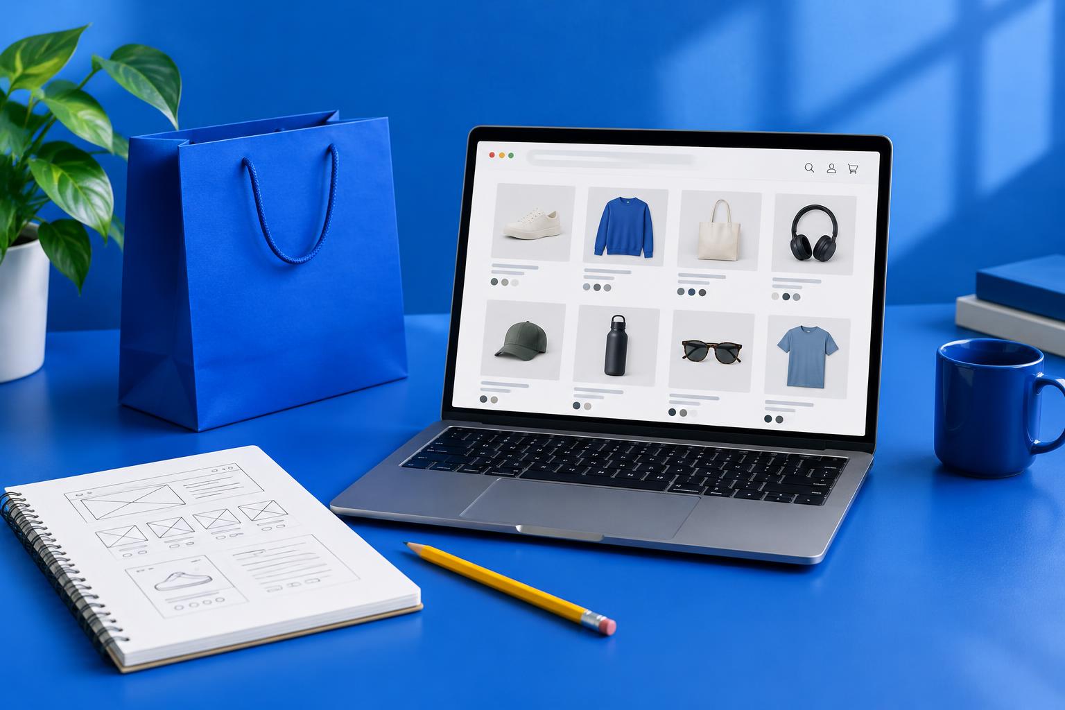
Make products easier to find
Use navigation labels that match how shoppers think about your range. A creative category name may feel distinctive but make a basic purchase harder. Review collection names, search behaviour and filters against the size and complexity of your catalogue.
A shopper landing directly on a product page also needs context. Offer clear routes to the relevant collection and genuinely related items. On mobile, check that menus and filters are usable without covering the entire browsing experience unnecessarily.
Answer the purchase questions on the product page
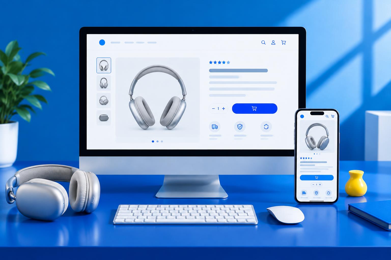
Good product pages explain what the item is, who it suits and what the shopper receives. Use clear photography, useful dimensions, materials and variant information. Delivery and return information should be easy to find before the customer commits.
Keep claims supportable. Genuine customer reviews and accurate stock information can help decision-making; invented ratings and false scarcity cannot. Place the main purchase control where it is easy to identify, and explain unavailable variants clearly.
- Readable product title, price and variant choices
- Images showing scale, detail and relevant angles
- Clear delivery costs or a route to calculate them
- Accessible size, care or compatibility information
- Visible contact and returns information
Treat mobile performance as part of design
Test with realistic content and devices, not only a fast desktop connection. Oversized images, multiple app scripts and unnecessary animation can slow the shopping experience. Prioritise features that serve a customer need rather than adding every available widget.
Check tap targets, text size, visible form errors and keyboard access. A technically fast page can still be difficult to use. Performance tools identify useful issues, but a score alone does not establish whether people can complete the journey.
Protect the launch and measure the result
Map old URLs to their appropriate replacements, check important integrations and complete test orders using the store’s supported test process. Keep a rollback plan and agree who monitors the store immediately after launch.
After launch, compare equivalent periods and account for promotions, traffic changes and seasonality. Test meaningful changes where traffic allows, rather than claiming the redesign caused every movement in revenue. Meshhoney can help turn an audit into a scoped store redesign with design and development working together.
A conversion-focused redesign removes uncertainty and friction; its success needs measurement, not a before-and-after screenshot.
Put your next idea into motion.
Tell us about your business and what you want to achieve. We’ll discuss the right scope for your project.
Discuss your projectFind your project direction